
Presenting results from an arbitrary number of models
9 minute read
The combination of tidyr::nest() and purrr:map() can be used to easily fit the same model to different subsets of a single dataframe. There are many tutorials available to help guide you through this process. There are substantially fewer (none I’ve been able to find) that show you how to use these two functions to fit the same model to different features from your dataframe.
While the former involves splitting your data into different subsets by row, the latter involves cycling through different columns. I recently confronted a problem where I had to run many models, including just one predictor at a time from large pool of candidate predictors, while also including a standard set of control variables in each.1 Given the (apparent) absence of tutorials on fitting the same model to different features from a dataframe using these functions, I decided to write up the solution I reached in the hope it might be helpful to someone else.2 Start by loading the following packages:
library(tidyverse)
library(broom)
library(modelsummary)
library(kableExtra)
library(nationalparkcolors)
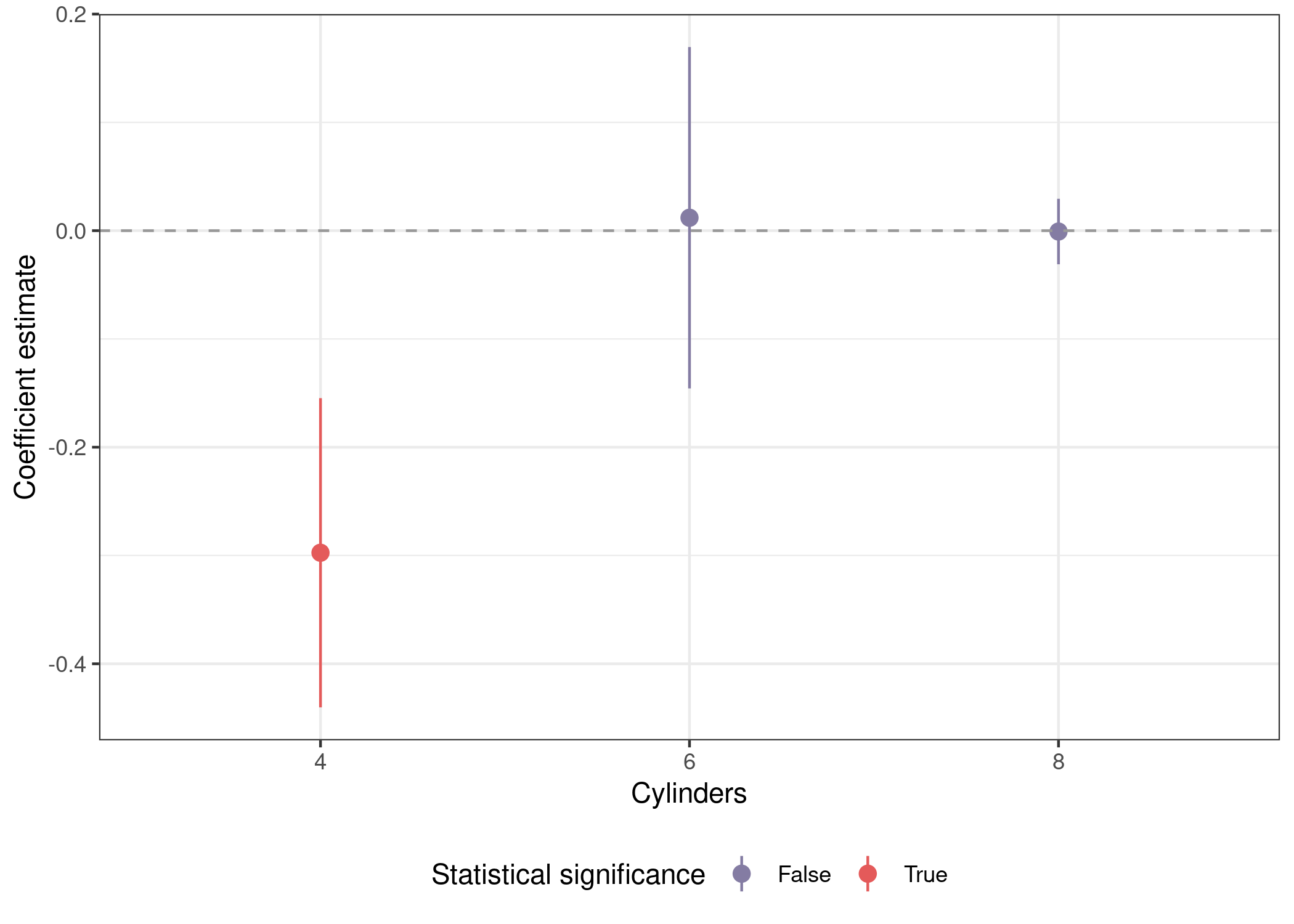
We’ll start with a recap of the subsetting approach, then build on it to cycle through features instead of subsets of the data. This code is similar to the official tidyverse tutorial above, but pipes the output directly to a ggplot() call to visualize the results.
mtcars %>%
  nest(data = -cyl) %>% # split data by cylinders
  mutate(mod = map(data, ~lm(mpg ~ disp + wt + am + gear, data = .x)),
         out = map(mod, ~tidy(.x, conf.int = T))) %>% # tidy model to get coefs
  unnest(out) %>% # unnest to access coefs
  mutate(sig = sign(conf.low) == sign(conf.high), # p <= .05
         cyl = as.factor(cyl)) %>% # factor for nicer plotting
  filter(term == 'disp') %>%
  ggplot(aes(x = cyl, y = estimate, ymin = conf.low, ymax = conf.high,
             color = sig)) +
  geom_pointrange() +
  geom_hline(yintercept = 0, lty = 2, color = 'grey60') +
  scale_color_manual(name = 'Statistical significance',
                     labels = str_to_title,
                     values = park_palette('Saguaro')) +
  labs(x = 'Cylinders', y = "Coefficient estimate") +
  theme_bw() +
  theme(legend.position = 'bottom')
Multiple predictors
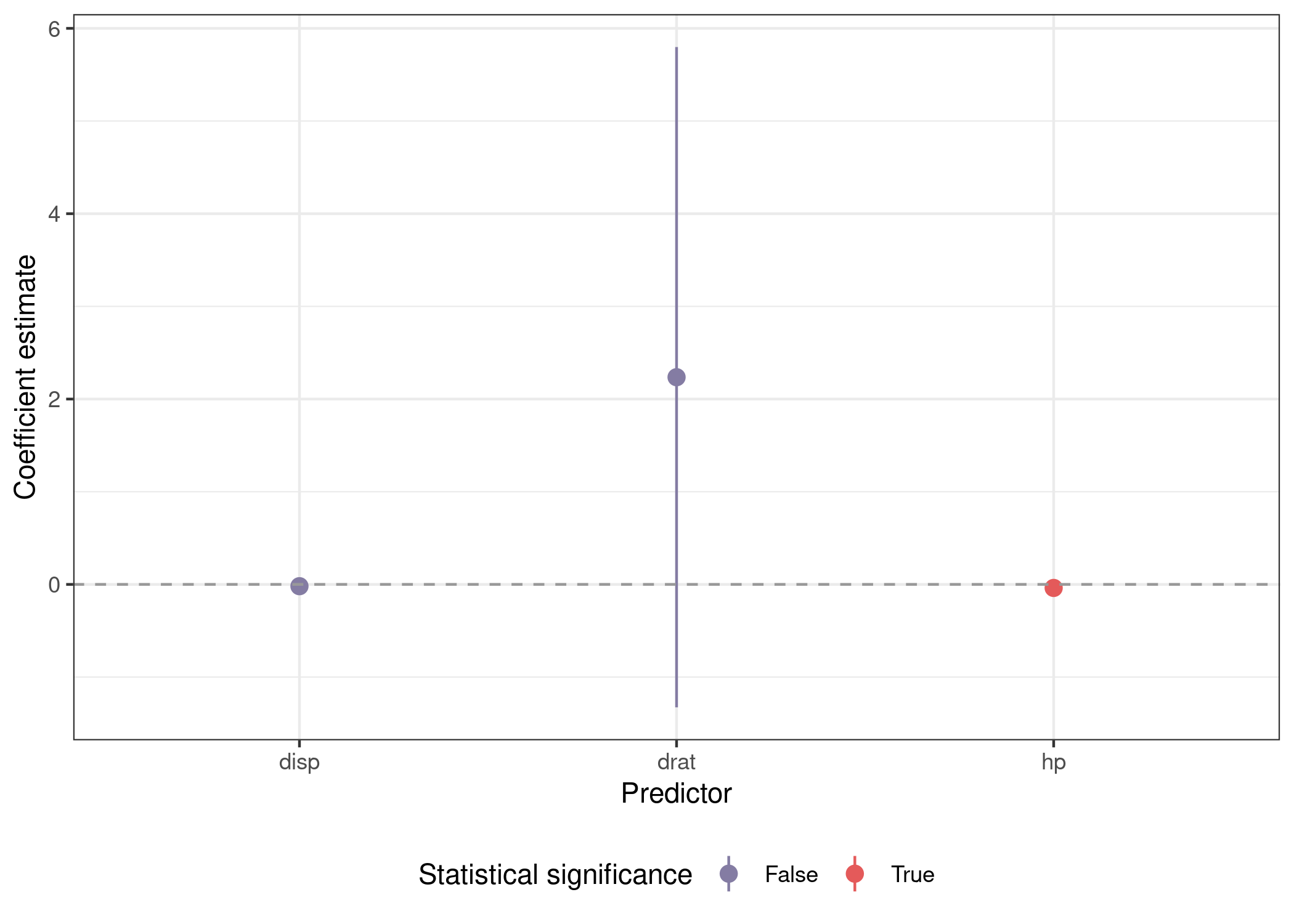
The first thing we have to do is create a custom fuction because we now need to be able to specify different predictors in different runs of the model. The code below is very similar to the code above, except that we’re defining the formula in lm() via the formula() function, which parses a character object that we’ve assembled via str_c(). The net effect of this is to fit a model where the pred argmument to func_var() is the first predictor. This lets us use an external function to supply different values to pred. Then we use broom::tidy() to create a tidy dataframe of point estimates and measures of uncertainty from the model and store them in a variable called out. Finally, mutate(pred = pred) creates a variable named pred in the output dataframe that records what the predictor used to fit the model was. We could retrieve this from the mod list-column, but this is approach is simpler both to extract the predictor programtically and to visually inspect the data. We use then purr::map_dfr() to generate a dataframe where each row corresponds to a model with with a different predictor.
func_var <- function(pred, dataset) {

  dataset %>%
    nest(data = everything()) %>%
    mutate(mod = map(data, ~lm(formula(str_c('mpg ~ ' , pred, # substitute pred
                                             ' + wt + am + gear')),
                               data = .x)),
           out = map(mod, ~tidy(.x, conf.int = T))) %>%
    mutate(pred = pred) %>%
    return()

}

## predictors of interest
preds <- c('disp', 'hp', 'drat')

## fit models with different predictors
mods_var <- map_dfr(preds, function(x) func_var(x, mtcars))

## inspect
mods_var
## # A tibble: 3 × 4
##   data               mod    out              pred
##   <list>             <list> <list>           <chr>
## 1 <tibble [32 × 11]> <lm>   <tibble [5 × 7]> disp
## 2 <tibble [32 × 11]> <lm>   <tibble [5 × 7]> hp
## 3 <tibble [32 × 11]> <lm>   <tibble [5 × 7]> drat
Plots
You can see our original dataframe that we condensed down into data with nest(), the model object in mod, the tidied model output in out, and finally the predictor used to fit the model in pred. Using unnest(), we can unnest the out object and get a dataframe we can use to plot the main coefficient estimate from each of our three models.
mods_var %>%
  unnest(out) %>%
  mutate(sig = sign(conf.low) == sign(conf.high)) %>%
  filter(term %in% preds) %>%
  ggplot(aes(x = term, y = estimate, ymin = conf.low, ymax = conf.high,
             color = sig)) +
  geom_pointrange() +
  geom_hline(yintercept = 0, lty = 2, color = 'grey60') +
  scale_color_manual(name = 'Statistical significance',
                     labels = str_to_title,
                     values = park_palette('Saguaro')) +
  labs(x = 'Predictor', y = "Coefficient estimate") +
  theme_bw() +
  theme(legend.position = 'bottom')
Tables
Things get slightly more complicated when we want to represent our results textually instead of visually. We can use the excellent modelsummary::modelsummary() function to create our table, but we need to supply a list of model objects, rather than the unnested dataframe we created above to plot the results. We can use the split() function to turn our dataframe into a list, and by using split(seq(nrow(.))), we’ll create one list item for each row in our dataframe.
Since each list item will be a one row dataframe, we can use lapply() to cycle through the list. The mod object in each one row dataframe is itself a list-column, so we need to index it with [[1]] to properly access the model object itself.3 The last step is a call to unname(), which will drop the automatically generated list item names of 1, 2, and 3, allowing modelsummary() to use the default names for each model column in the output.
tab_coef_map = c('disp' = 'Displacement', # format coefficient labels
                 'hp' = 'Horsepower',
                 'drat' = 'Drive ratio',
                 'wt' = 'Weight (1000 lbs)',
                 'am' = 'Manual',
                 'gear' = 'Gears',
                 '(Intercept)' = '(Intercept)')

mods_var %>%
  split(seq(nrow(.))) %>% # list where each object is a one row dataframe
  lapply(function(x) x$mod[[1]]) %>% # extract model from data dataframe
  unname() %>% # remove names for default names in table
  modelsummary(coef_map = tab_coef_map, stars = c('*' = .05))
Bonus
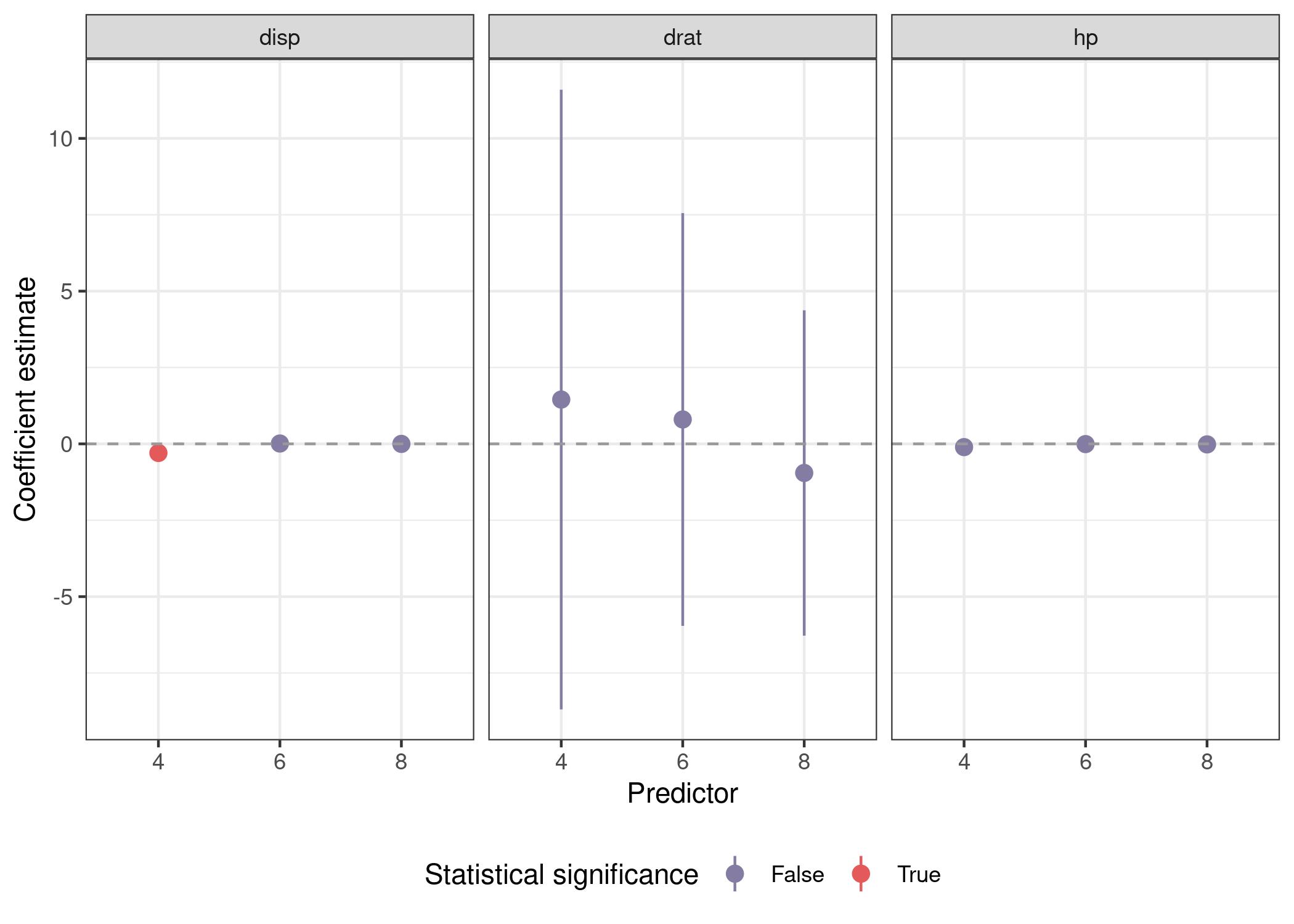
Now, let’s combine both approaches. We’re going to be splitting our dataframe into three sub-datasets by number of cylinders while also fitting the same model three times with 'disp', 'hp', and 'drat' as predictors. The only changes to func_var() are to omit cyl from the nesting, and to recode it as a factor to treat it as discrete axis labels.
func_var_obs <- function(pred, dataset) {

  dataset %>%
    nest(data = -cyl) %>%
    mutate(mod = map(data, ~lm(formula(str_c('mpg ~ ' , pred,
                                             ' + wt + am + gear')),
                               data = .x)),
           out = map(mod, ~tidy(.x, conf.int = T)),
           cyl = as.factor(cyl),
           pred = pred) %>%
    select(-data) %>%
    return()

}

preds <- c('disp', 'hp', 'drat')

mods_var_obs <- map_dfr(preds, function(x) func_var_obs(x, mtcars))
Plotting involves a call to facet_wrap(), but is otherwise similar.
mods_var_obs %>%
  unnest(out) %>%
  mutate(sig = sign(conf.low) == sign(conf.high)) %>%
  filter(term %in% preds) %>%
  ggplot(aes(x = cyl, y = estimate, ymin = conf.low, ymax = conf.high,
             color = sig)) +
  geom_pointrange() +
  geom_hline(yintercept = 0, lty = 2, color = 'grey60') +
  facet_wrap(~pred) +
  scale_color_manual(name = 'Statistical significance',
                     labels = str_to_title,
                     values = park_palette('Saguaro')) +
  labs(x = 'Predictor', y = "Coefficient estimate") +
  theme_bw() +
  theme(legend.position = 'bottom')
Creating tables is more complex. Here we have to cycle through each predictor with a call to map(), filter the output to only contain results from models using that predictor, then split the dataframe by cylinders instead of into separate rows. Note the use of unname(preds_name[x]) to retrieve full english predictor names to create more useful table titles. We’ll also be using tab_coef_map from above to get more informative row labels in our tables. Running the code below generates the following tables:
## named vector for full english predictor names
preds_name <- c('displacement', 'horsepower', 'drive ratio')
names(preds_name) <- preds

map(preds, function(x) mods_var_obs %>%
      filter(pred == x) %>% # subset to models using predictor x
      select(mod, cyl) %>% # drop tidied model
      split(.$cyl) %>% # split by number of cylinders in engine
      lapply(function(y) y$mod[[1]]) %>% # only one item in each list
      modelsummary(title = str_c('Predictor: ',
                                 unname(preds_name[x]), # formatted name
                   coef_map = tab_coef_map,
                   stars = c('*' = .05),
                   escape = F) %>%
      add_header_above(c(' ' = 1, 'Cylinders' = 3))) %>%
  walk(print) # invisibly return input to avoid [[1]] in output
We’ve got one table for each predictor we considered, and each one is split into three models for cars with four, six, and eight cylinder engines. This is a bit overkill for this example, but it’s all you have to do to scale this framework up to hundreds of potential predictors is put more items in preds.
Yes, I know this is a perfect situation to use LASSO. Sometimes people (reviewers) want certain models run, and you just have to run them. ↩
There’s a very real chance that someone else is me in six months. ↩
Things get a lot more complicated if your
split()call produces a list of dataframes that aren’t one row each, so make sure that’s what you’re getting before you proceed. ↩