
Customizing an Academic Website
10 minute read
This is a followup to my previous post on creating an academic website. If you’ve followed that guide, you should have a website that’s professional-looking and informative, but it’s probably lacking something to really make it feel like your own. There are an infinite number of ways you could customize the academicpages template (many of them far, far beyond my abilities) but I’m going to walk you through the process I used to start tweaking my website. The goal here isn’t to tell you how you should personalize your website, but to give you the tools to learn how to implement whatever changes you want to make.
You’ll notice that the differences between my website and the template aren’t limited to my mug in the sidebar on the left. These differences are especially apparent if you compare my publications page with the template’s. You’ll notice on my page that article titles no longer link to separate pages and I’ve got fancy icons like to link to my PDF copy and to link to the version of record.
I’ve made several minor changes from the template to make my website feel a bit more like my own. These tweaks are varyingly difficult to accomplish, but they all involve a bit of trial and error. While academicpages is a great template, the accompanying documentation isn’t particularly useful if you want to make any changes that go beyond content into formatting. Thus, each new tweak I implement begins with something of a scavenger hunt.
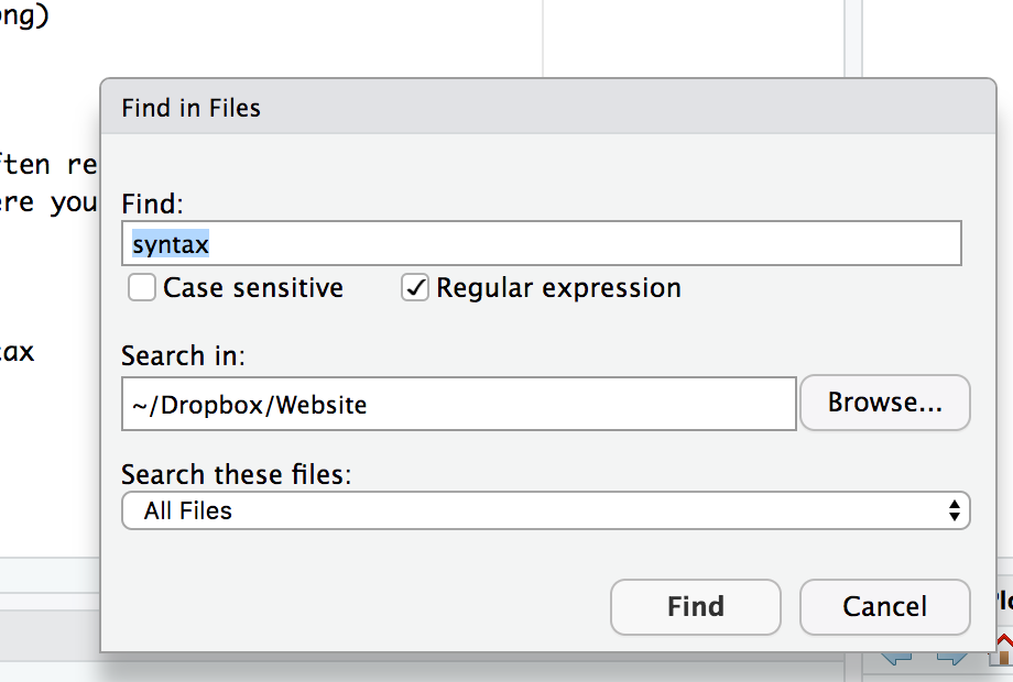
Essentially, you need to track down where in the source code of your website a variable is originally defined, and then edit it there. Luckily, RStudio makes this relative straightforward with its Find in Files function. You can access this special search from the Edit menu, or by pressing Cmd+Shift+c on MacOS or Ctrl+Shift+c otherwise. Once you’ve brought up the Find in Files dialog, enter the name of the variable you’re looking for in the ‘Find’ box and your website’s directory in the ‘Search in’ box (for me that’s ~/Dropbox/Website).
Easier on the eyes
One thing I don’t like about the template’s settings out of the box is the font size in highlighted code blocks. It’s way too small! While small the small font size makes it more likely that an entire line of code will fit on a screen without having to scroll, how useful is that if you have to squint to see what’s there?
My first order of business in customizing my site was thus to increase the font size used in code blocks. I know that code highlighting functions are often referred to as syntax highlighters. Using this knowledge, I searched for “syntax” using the Find in Files dialog as seen below:
The most relevant hit is a file called _sass/syntax.scss. The _sass directory is where you’ll find lots of options to change the appearance of your site since it contains the CSS code that determines much of how your site looks. If you scroll through _sass/syntax.scss, this chunk of code controls how text is rendered in code boxes:
.highlight {
  margin: 0;
  font-family: $monospace;
  font-size: $type-size-7;
  line-height: 1.8;
}
We’ve found our next clue! We need to figure out where $type-size-7 is defined. If you do a Find in Files search for that, you’ll learn it’s in _sass/variables.scss. Open that file and Cmd+f (Ctrl+f not on a Mac) for $type-size-7, and you’ll find this chunk of code:
/* type scale */
$type-size-1                : 2.441em;  // ~39.056px
$type-size-2                : 1.953em;  // ~31.248px
$type-size-3                : 1.563em;  // ~25.008px
$type-size-4                : 1.25em;   // ~20px
$type-size-5                : 1em;      // ~16px
$type-size-6                : 0.75em;   // ~12px
$type-size-7                : 0.6875em; // ~11px
$type-size-8                : 0.625em;  // ~10px
Here’s where font sizes are defined for the entire website! Luckily the code is well-commented, so we know that $type-size-7 used in code blocks $\approx$ 11 pixels high. I first tried setting it to $type-size-5, but that was too big for my tastes. Alas $type-size-6 was too small, and so I resolved to make my own.
The font sizes are defined in ems (a unit of typography you’re no doubt familiar with if you’ve also spent too much time mucking about with LaTeX) so it’s easy to create a new one. $type-size-6 is 0.75 ems and $type-size-5 is 1 em, so to find the exact middle of them we can do
(1 + .75) / 2
## [1] 0.875
Now all we have to do is define our new font size in _sass/variables.scss
$type-size-syntax : 0.875em; // ~14px
and tell the site to use it in _sass/syntax.scss
.highlight {
  margin: 0;
  font-family: $monospace;
  font-size: $type-size-syntax;
  line-height: 1.8;
}
Save all these changes, restart your local webserver with bundle exec jekyll serve (or wait for it to rebuild and reload if it was already running) and check out the changes. If everything went smoothly, you should have larger and easier to read text in any code blocks on your website.
Fixing fancy icons
While you’re messing around in _sass/syntax.scss, there’s another easy fix that I highly recommend doing. The version of the template at the time I’m writing this has a small error in this file that prevents code boxes from rendering properly. You may be wondering why code boxes have a small square in the top right corner of them; I know I was. Take a look below for an example of this from my software page:
It turns out there’s supposed to be a little ‘code’ icon there, like this . I did some digging on Stack Overflow, and found this answer, which told me that there’s an error with how _sass/syntax.scss references the Font Awesome library the icon comes from.
&:before {
  position: absolute;
  top: 0;
  right: 0;
  padding: 0.5em;
  background-color: $lighter-gray;
  content: "\f121";
  font-family: "fontawesome" !important;
  font-size: $type-size-6;
  line-height: 1;
  text-transform: none;
  speak: none;
}
The font-family line should be font-family: "Font Awesome 5 Free" !important;. Once you’ve made this change, the icon should show up.
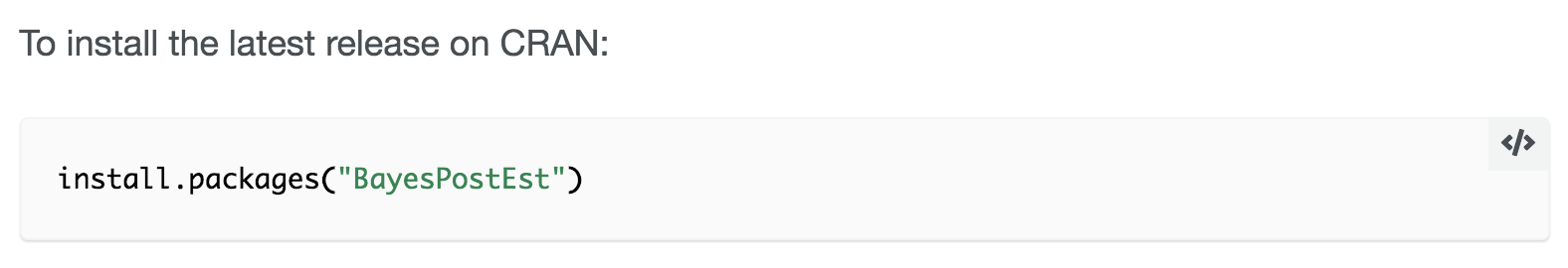
I’ve submitted a pull request fixing the issue, so if you’re reading this in the future hopefully it’s been fixed in the template and you have no idea what I’m talking about.
Adding some color
While we’re in _sass/variables.scss, there are a couple of other easy changes we can make. I never particularly liked the light blue that the template uses for links. There’s a section in _sass/variables.scss that controls what color links appear as.
/* links */
$link-color                 : $info-color;
$link-color-hover           : mix(#000, $link-color, 25%);
$link-color-visited         : mix(#fff, $link-color, 25%);
$masthead-link-color        : $primary-color;
$masthead-link-color-hover  : mix(#000, $primary-color, 25%);
Looking at this code, we can see that $link-color is defined as the same as $info-color. Further up, this is defined as
$info-color : #52adc8;
You’ll notice that $info-color is defined with an alphanumeric string and not in a more familiar format like RGB. That’s because it’s a web color in hexadecimal format. If you Google search color picker you’ll find a handy little applet where you can preview different hex colors or even convert from RGB to hex representation. Since I am a postdoc, I decided to just use my institution’s colors. If you change $info-color to any other color it will change the color of links across your website. Remember to wait for your webserver to reload the changes, otherwise you won’t be able to see them
Pushing buttons
The pages where I present my research highlight one of the other big changes I’ve made to my site. The buttons I use to link to papers and replication archives (see here for an example) are not part of the template. I’d originally just used text links here, and thought using some buttons instead might liven up the page a bit. Unfortunately, the default buttons defined in the Academicpages template don’t fit super well given the other changes I’ve made.
The default button looks like this, which is fine, but doesn’t fit with a more colorful custom theme. My new themed button looks like this, which fits a little better and has less space around it.1
While both buttons have a nice hover effect where they change color to let you know you’re over them, the second one incorporates the site’s accent color and is a bit more dynamic since the text changes color in addition to the background. Like most things CSS, buttons are defined in the _sass directory in _sass/buttons.scss.
There are lots of existing button types defined here, but we want to create our own. You can edit the default button styling in _sass/buttons.scss. If we redefine the existing base button class, we can end up with all kinds of weird side effects for other elements of the site, like the social media share buttons at the bottom of this post. To do this, we’ll define a new button subclass, which inherits the aspects of a button on the site but only uses the special behavior when we explicitly tell a button to do so.
After some time poking around the W3Schools page on buttons, and a lot of trial and error, I came up with the following CSS code:
/* research page buttons */
&--research {
  display: inline-block;
  margin-bottom: 0.25em;
  padding: 0.125em 0.25em;
  color: $link-color;
  text-align: center;
  text-decoration: none !important;
  border: 1px solid;
  border-color: $link-color;
  border-radius: $border-radius;
  cursor: pointer;

  &:hover {
    color: #fff;
    background-color: $link-color !important;
  }
}
The key parts are
color: $link-color;: use the site accent color for the texttext-decoration: none !important;: don’t underline the button textborder: 1px solid;: draw a one pixel border around the buttonborder-color: $link-color;: use the site accent color for the borderborder-radius: $border-radius;: use a four pixel radius for the border ($border-radiusis defined in_sass/variables.scss)
To add a button to a page, you simply tack on {: .btn--research} after a link, like so
[this](#Buttons){: .btn--research}
Going forward
This is just a brief overview of the ways you can tweak your website from the base provided by the template. Let Google and Stack Overflow be your guides. There will be some trial and error, but the beauty of git is that even if you break something it’s easy to roll back to changes to when everything was working.
You’ll notice that this button is very similar to the ones that the Hugo Academic theme uses. Just because I don’t like the theme as a whole doesn’t mean there aren’t really elegant parts of it. ↩